Blocks
Buttons Blocks
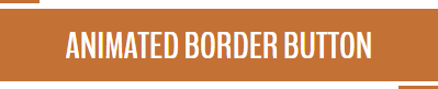
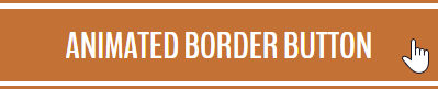
Animated Border Button
"Animated Border Button" inserts a button (common, reset, or submit button), with an animated border on hover.
Name:
Text:
Onclick Event:
Button Type: , ,
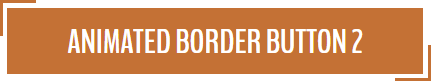
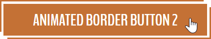
Animated Border Button 2
"Animated Border Button 2" inserts a button (common, reset, or submit button), with an animated border on hover.
Name:
Text:
Onclick Event:
Button Type: , ,
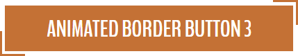
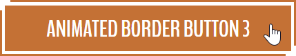
Animated Border Button 3
"Animated Border Button 3" inserts a button (common, reset, or submit button), with an animated border on hover.
Name:
Text:
Onclick Event:
Button Type: , ,
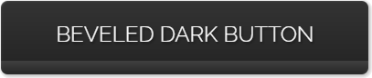
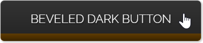
Beveled Dark Button
"Beveled Dark Button" inserts a button (common, reset, or submit button), with a beveled effect.
Name:
Text:
Onclick Event:
Button Type: , ,
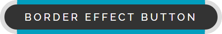
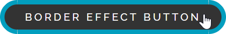
Border Effect Button
"Border Effect Button" inserts a button (common, reset, or submit button), with an animated border on hover.
Name:
Text:
Onclick Event:
Button Type: , ,
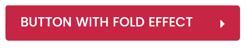
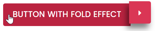
Button With Fold Effect
"Button With Fold Effect" inserts a button (common, reset, or submit button), with a fold effect on hover.
Name:
Text:
Onclick Event:
Button Type: , ,
Button With Scaled Icon
"Button With Scaled Icon" inserts a button (common, reset, or submit button), with an icon selected from the list.


Name:
Text:
Icon:
Onclick Event:
Button Type: , ,
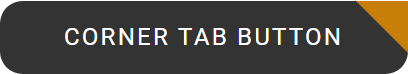
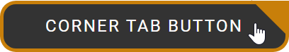
Corner Tab Button
"Corner Tab Button" inserts a button (common, reset, or submit button), with a corner tab.
Name:
Text:
Onclick Event:
Button Type: , ,
Corner Tab Button 2
"Corner Tab Button 2" inserts a button (common, reset, or submit button), with a corner tab.


Name:
Text:
Onclick Event:
Button Type: , ,
Corner Tab Button 3
"Corner Tab Button 3" inserts a button (common, reset, or submit button), with a corner tab.


Name:
Text:
Onclick Event:
Button Type: , ,
Curtain Effect Button
"Curtain Effect Button" inserts a button (common, reset, or submit button), with a curtain effect.


Name:
Text:
Onclick Event:
Button Type: , ,
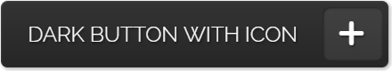
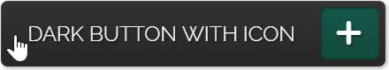
Dark Button With Icon
"Dark Button With Icon" inserts a dark button (common, reset, or submit button), with a plus icon.
Name:
Text:
Onclick Event:
Button Type: , ,
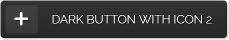
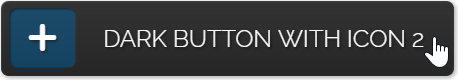
Dark Button With Icon 2
"Dark Button With Icon 2" inserts a dark button (common, reset, or submit button), with a plus icon.
Name:
Text:
Onclick Event:
Button Type: , ,
Rounded Button
"Rounded Button" inserts a button (common, reset, or submit button), with a rounded design.
Name:
Text:
Onclick Event:
Button Type: , ,
Button Color:
Button Size:
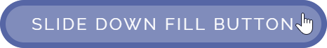
Slide Down Fill Button
"Slide Down Fill Button" inserts a button (common, reset, or submit button), with a down fill effect.

Name:
Text:
Onclick Event:
Button Type: , ,
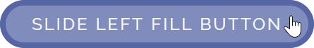
Slide Left Fill Button
"Slide Left Fill Button" inserts a button (common, reset, or submit button), with a left fill effect.

Name:
Text:
Onclick Event:
Button Type: , ,
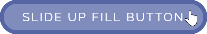
Slide Up Fill Button
"Slide Up Fill Button" inserts a button (common, reset, or submit button), with an up fill effect.

Name:
Text:
Onclick Event:
Button Type: , ,